In preparation for upcoming user interface (UI) and search experience upgrades that will be integrated within Matrix in the near future, the main menu bar that appears across the top of every Matrix screen has been slightly adjusted.
This change is largely cosmetic and is designed to make the menu items appear more clearly and provide better accessibility.
Here is what the menu bar used to look like:

And here is the new menu bar:

The major difference is that the text of the menu options is now in all capital letters. Separator bars have also been inserted in between each menu item to provide additional clarity.
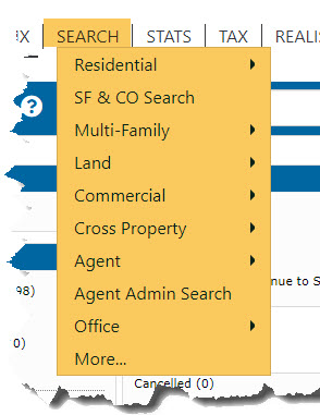
The functionality of the menu remains the same. If you hover over a menu item (Search, for instance), you will get the same options you always have:
*****************
The only time the functionality of the menu bar could change would be if your web browser is zoomed in to a significant degree (more than 250% of the normal zoom level). When this occurs, there is literally no room for the menu because everything on the screen is so large. To account for this, a hamburger menu icon (three horizontal bars) will appear in place of the menu bar in the upper right corner of the screen:

When you click the hamburger menu icon, you will see the following menu:
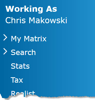
It is essentially the same menu, just in a vertical orientation instead of the normal horizontal layout. All of the usual menu options are present.
Comments
Please sign in to leave a comment.